If you love when color announcements start coming in, you’re in good company. Trending style statements that influence the interior design world also have the same effect on fashion. New York Fashion Week added some movement to both worlds by revealing the upcoming pallets for 2026. Mixed with sophistication and romance, it’s overflowing with emotional intensity. Let’s take a look!
The Palette
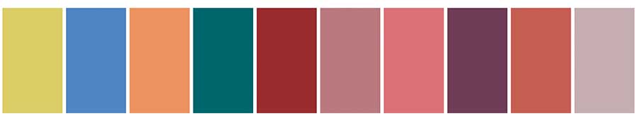
Laurie Pressman of the Pantone Color Institute explains that this year’s palette offers the
“Freedom to redefine color usage, this season’s palette contrasts warm familiar shades with more vibrant, stimulating colors and foundational tones.”
In past seasons, blues, greens, and yellows have dominated the conversation. This year, the spotlight shifts toward reds, pinks, and purples, ushering in a fresh opportunity for expressive, emotionally rich design.
Keeping it Classic Neutral
Alongside the main palette, Pantone also introduces a set of Timeless Classics. They’re neutral tones designed to ground the bolder colors. While these hues are typically subtle and versatile, you’ll often find a surprise statement shade included for balance.

Current Color Inspiration
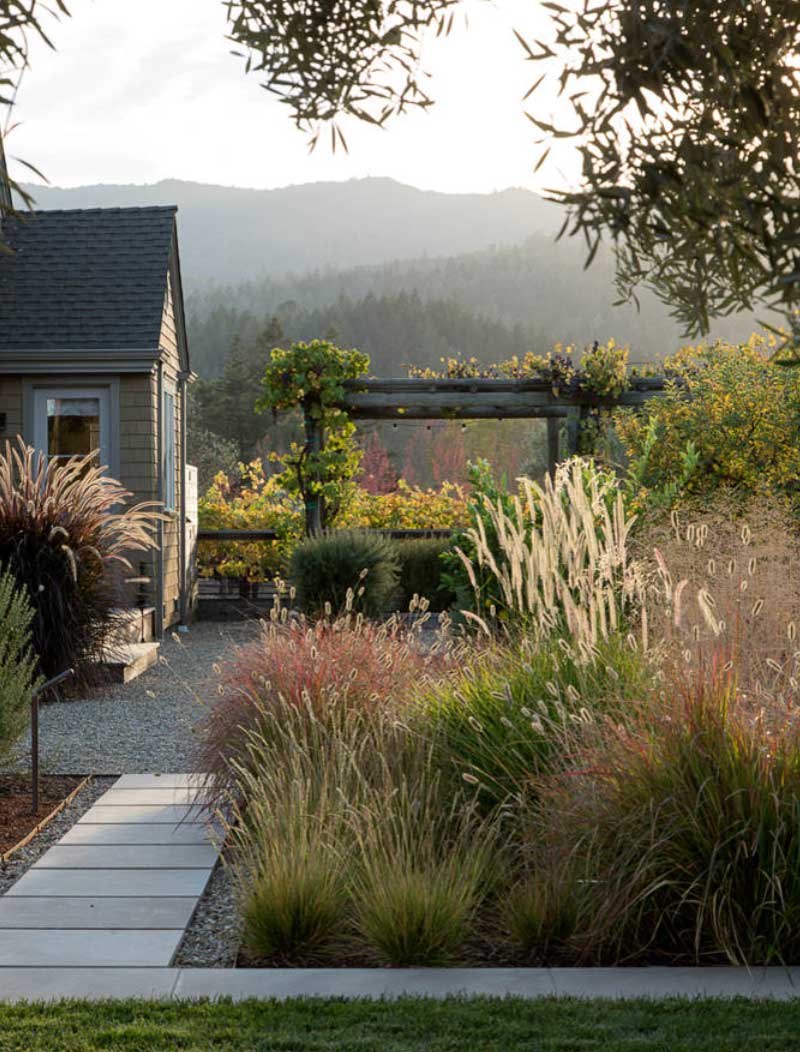
It’s been said time and time again. Nature truly is the best color inspiration. This year’s selection stay true to that statement. Take a look at the way this landscape encompasses this year’s classic palette. The colors seem soft but exude dimension and layering. It’s a perfect reminder that pairing natural tones can elevate home design with effortless beauty.
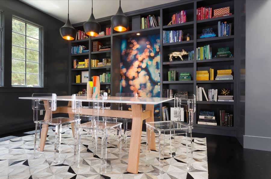
Dining Room: Good Taste
The place you gather friends and family to enjoy laughs and a meal should be just as amazing as the company. Take a look at this dining room. The black built-in shelves demand an elevated sophistication with that geometric rug and soft neutrals. But the real magic happens with those bold color accents. Pops of blue, red, yellow, and green leap right from the artwork to bring energy to the space. This year’s palette is about self-expression and this dining room design absolutely nails it.
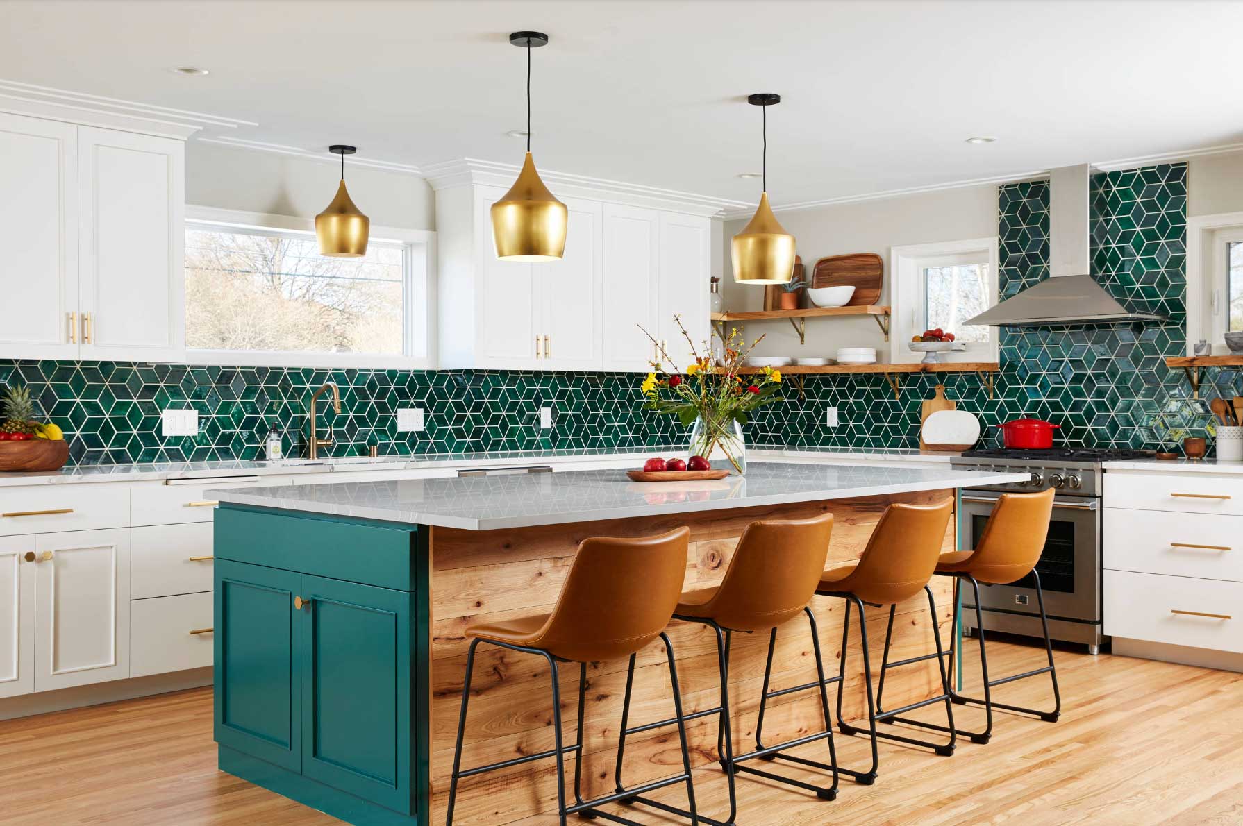
Savor the Kitchen
A white kitchen is timeless, but this year’s palette takes it further. Accents like Alexandrite, one of Pantone’s bold picks, brings just that bold pop of color we’ve been craving. It’s vibrant and enchanting ready to make this kitchen come to life.
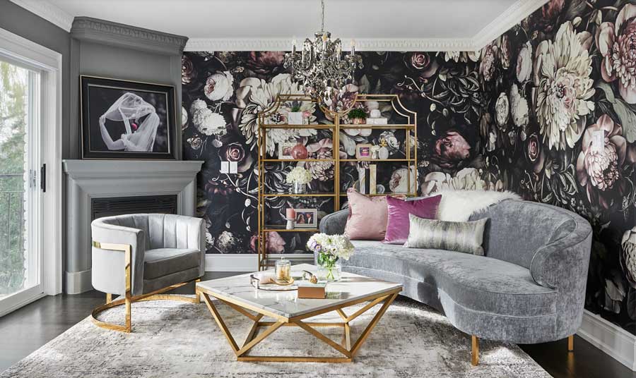
Living Room Romance
This year’s colors brings a romantic vibe. There are bold reds, pretty pinks, and dreamy purples. Bring passion into your home with these alluring hues. Picture yourself after a long day in this living room. Do you have a living room design list you want to accomplish?
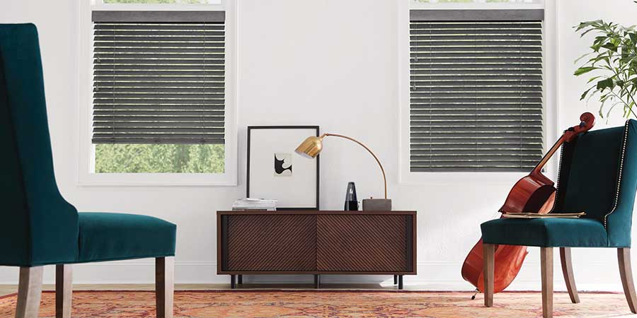
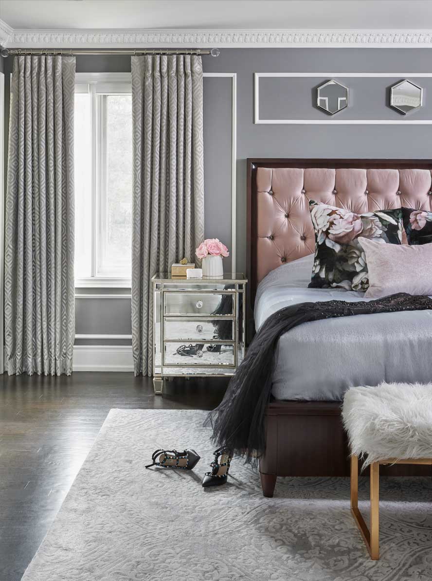
Dreamy Bedroom Colors
Make your bedroom a sanctuary. These calm grays ground the space, while that dusty rose adds warmth and charm. It’s your perfect place to drift off in style with a dreamy bedroom design. Talk to our team about your bedroom atmosphere–and the solutions you need to enjoy the light but block it, too!
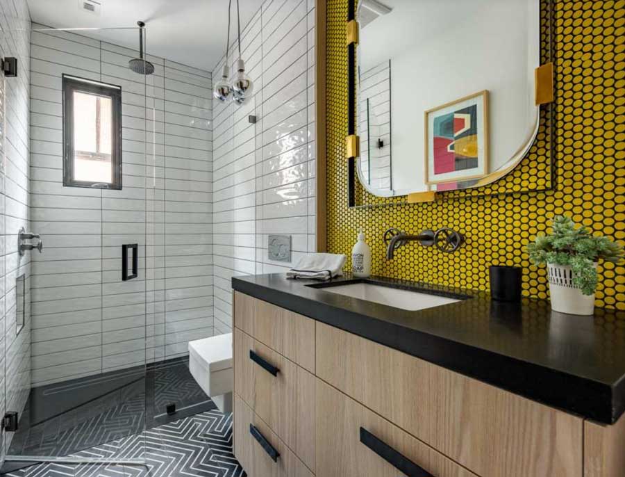
Bathroom Revamp
Bathrooms are the perfect place to experiment. Whether you choose bold color splashes or playful geometric patterns, this space gives you freedom to showcase personal style without impacting the rest of the home.
Ready for Some Color?
This year’s palette is alive with possibility. We are looking forward to what the design world will do with this color palette. Whether you’re drawn to grounding neutrals, romantic hues, or vibrant pops of color, surrounding yourself with shades you love will make your home uniquely yours. Visit Bazaar Home Decorating to explore fabrics and window coverings in-store, or schedule a free in-home design consultation with our experts. Contact us today to get started.