As the new year begins, you may be appreciating what already works in your home but eager to create space for what’s next. That sense of renewal extends beyond resolutions and into the home, and we have just the inspiration to get started. The 2026 Colors of the Year have officially arrived. This year’s selections span a wide range of moods and styles, making it easier than ever to find a shade that feels just right for you. Let’s dive in.
Color Makes a Difference
Color plays a powerful role in how we experience a room. It can influence mood, focus, and overall well-being. Some hues energize, others calm. However, the most important factor is personal preference. That’s key when designing a home that truly feels like yours. Our 2026 colors highlight the standout selections from top paint brands and explore how these shades can shape the look and feel of your space. Whether used on walls or layered in through decor, few design choices transform a room as effectively as color.
The Colors of 2026
Behr Paint: Hidden Gem
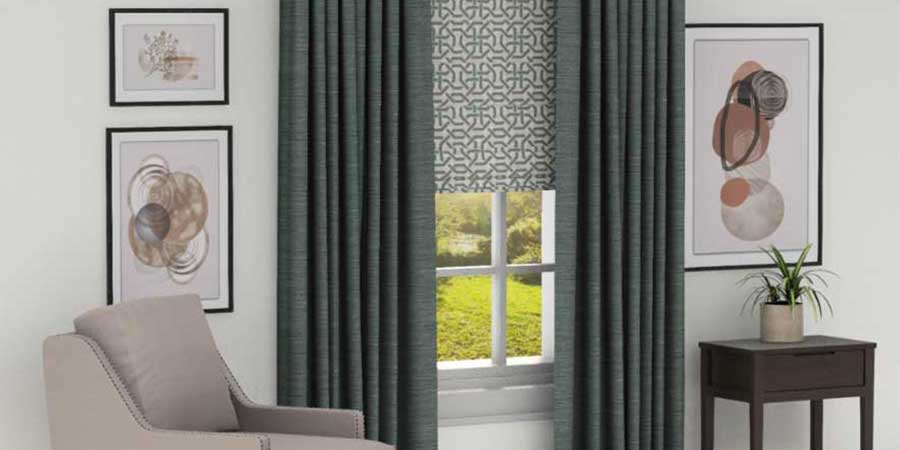
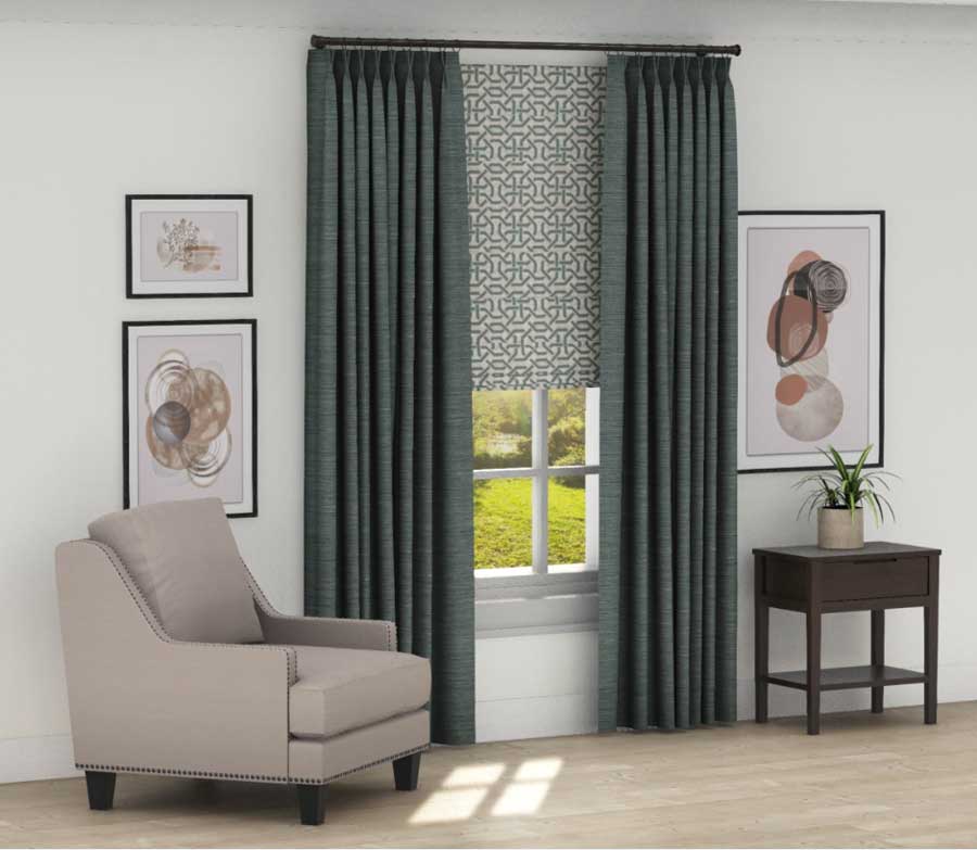
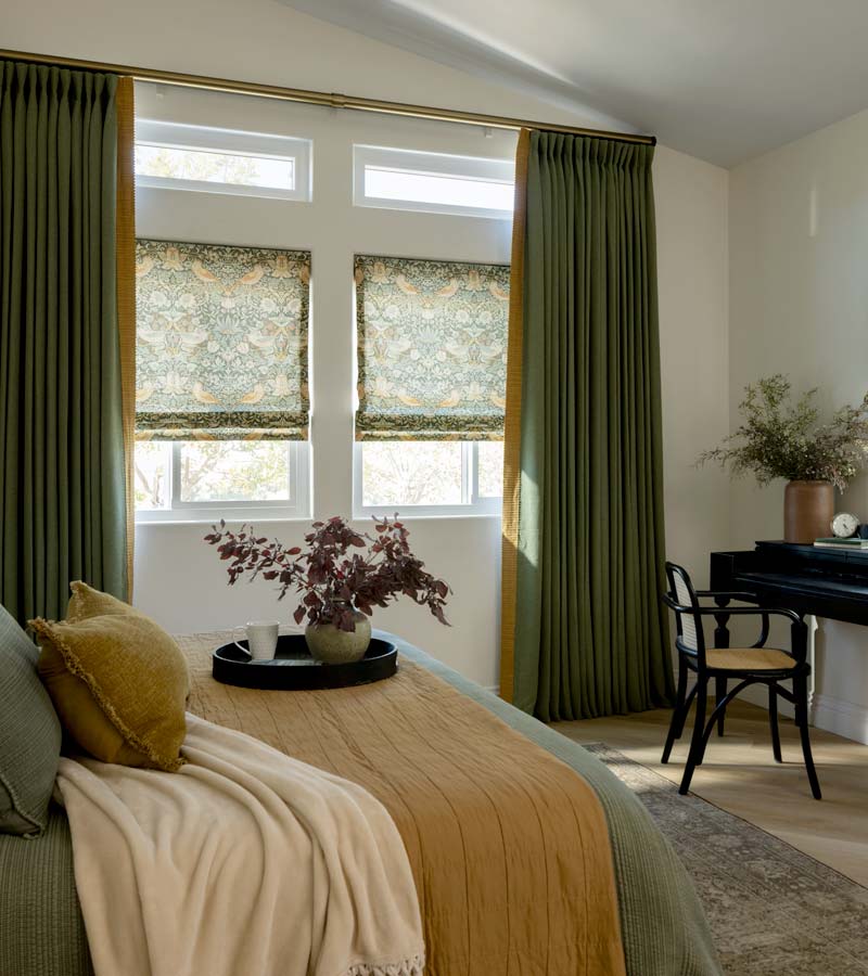
A smoky jade with depth, Hidden Gem brings a sense of calm. This jewel-toned green blends hints of teal with soft gray undertones, striking a perfect balance between comfort and elegance. The result is a space that feels curated yet deeply personal. Ideal for bedrooms and bathrooms, this shade will also shine through accents like upholstery, artwork, and décor.
Hidden Gem makes a striking statement at the window, whether used in solid fabrics or expressive patterns. We expect to see it woven seamlessly into drapery and roman shade collections. Softer, less-saturated variations will also emerge for a more understated look. You can pair this color with matte black, warm walnut, or brushed gold finishes for a polished result.
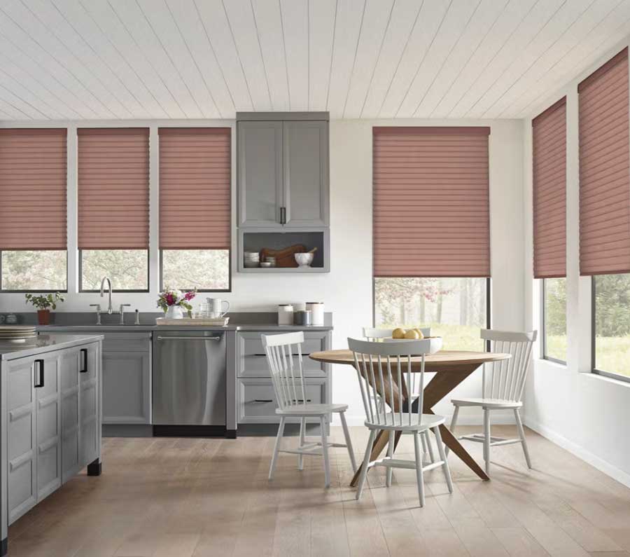
Sherwin-Williams: Universal Khaki
Universal Khaki delivers a sense of ease as a timeless, refined neutral. Tailored yet inviting, this beige-tan shade has gentle green-gray undertones. It softly warms a room without overpowering it, making it a great foundational wall color. As a backdrop, it allows furniture, textures, and finishes to take center stage.
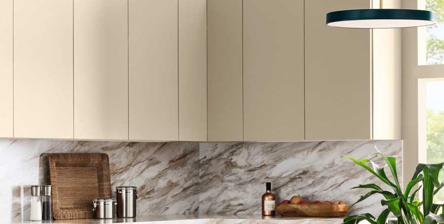
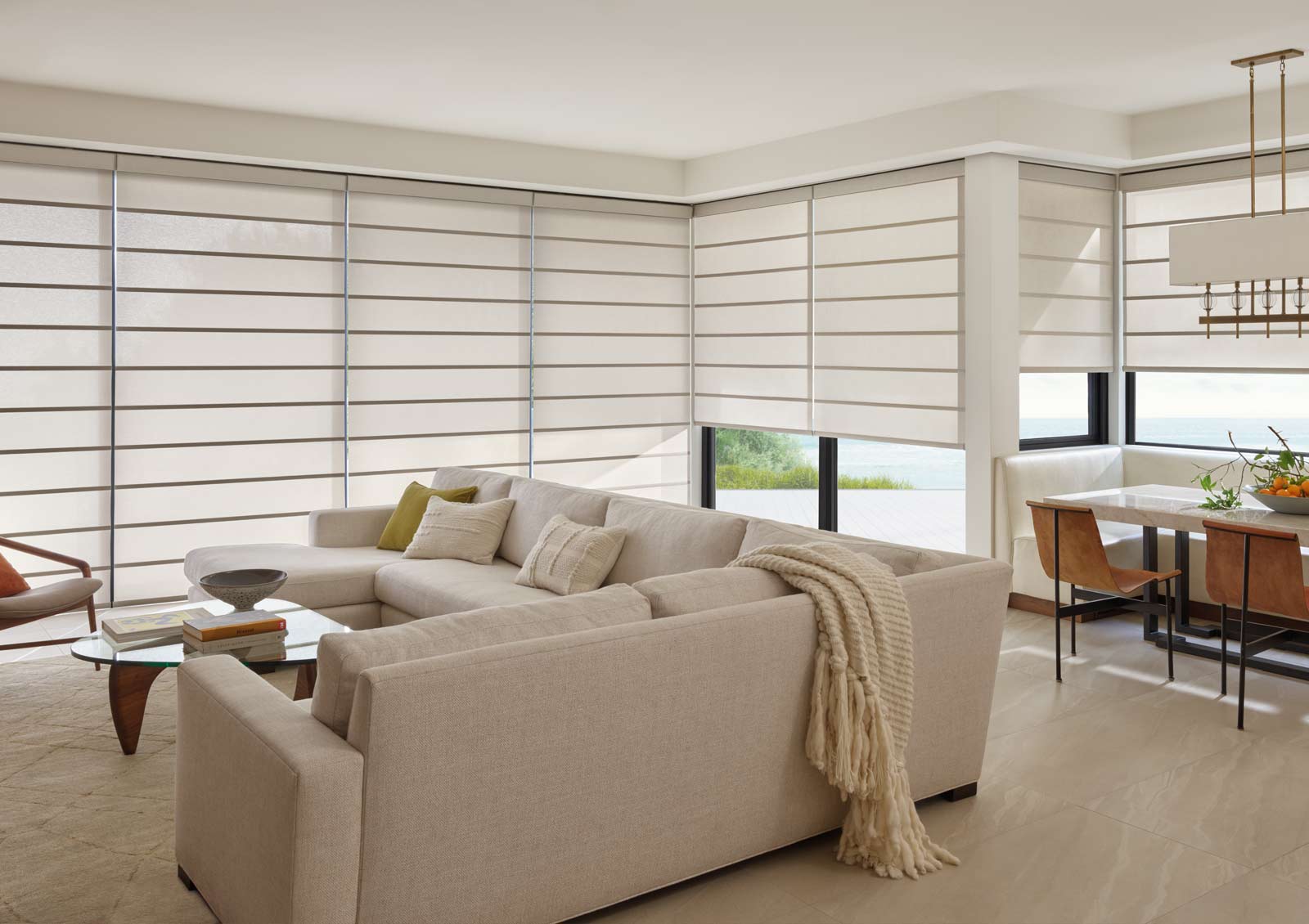
If there’s one color influence you’ll see everywhere in window treatments in 2026, it’s most likely this warm-neutral hue. These tones remain a favorite for their versatility and ability to diffuse light beautifully. From rollers and romans to sheers, woven shades, and cellular options, the possibilities are endless. Think about pairing it with aged brass or deep brown hardware for added warmth.
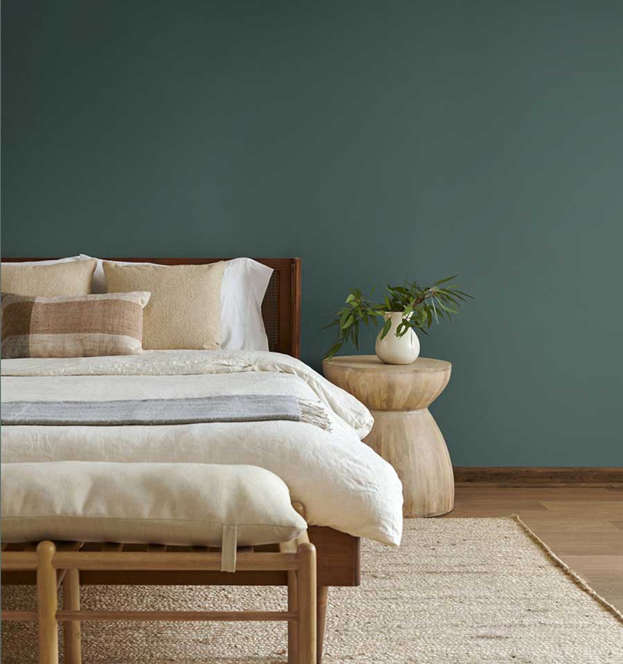
Valspar: Warm Eucalyptus
Warm Eucalyptus channels the serenity of nature indoors. This soft green carries sage-like qualities with gray undertones, making it approachable and calming. For those interested in introducing color without overwhelming a room, this hue is a wonderful choice. It’s especially well-suited for kitchen cabinetry, laundry rooms, and home office built-ins.
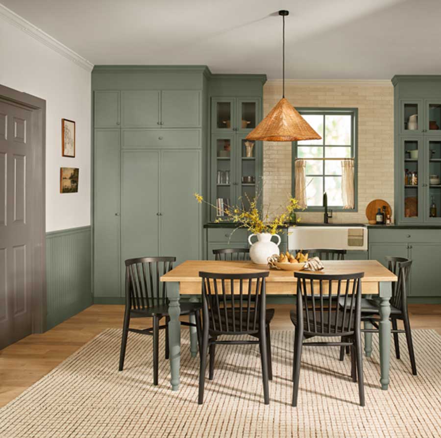
Green remains a timeless go-to for window design. Complement this shade with clay-toned neutrals, white oak finishes, and oil-rubbed bronze accents.
Benjamin Moore: Silhouette
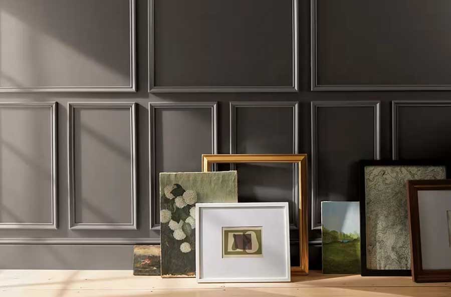
Brown is proudly staying in the spotlight, and Silhouette leads with confidence. This rich shade evokes lived-in warmth while maintaining an elevated, velvety sophistication. While it is deeper in tone, natural light highlights its dimension without making the space feel heavy. Expect to see its influence in accent walls and richly stained wood finishes throughout interiors.
Silhouette will be seen across many window coverings. From dark-stained wood blinds and plantation shutters to luxe fabrics in custom shades and drapery, this color story brings depth and refinement. Pair with chalky ivory hues or antique brass for a timeless finish.

PPG: Warm Mahogany
Warm Mahogany is a deep brown-red color that exudes richness and warmth. It feels grounded yet elevated. This shade works beautifully for color-drenching or as an accent through furnishings and décor for a more restrained statement.
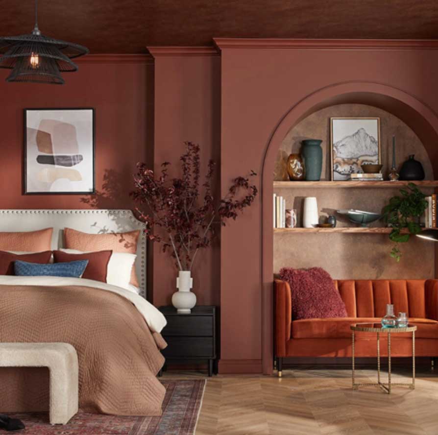
While red isn’t traditionally the most common choice for window treatments, it can be striking when done well. From soft blush tones to garnet, terracotta, and mahogany, these hues have range. Fabric choice plays a key role, with light-filtering materials adding brightness and room-darkening options introducing luxurious depth. Bronzed metals, dark woods, and caramel tones complement Warm Mahogany well!
WGSN & Coloro: Transformative Teal
Transformative Teal is optimistic and effortlessly energizing. It lives up to its name! This dynamic blend of blue and green is instantly captivating. Interestingly, we anticipate seeing it used both boldly and subtly. Think dramatic coverings or thoughtfully placed accents in art, décor, and textiles.
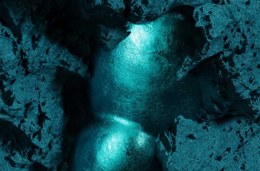
This invigorating teal brings a sense of movement and positivity to interiors. In window treatments, it will shine as an eye-catching detail within patterned fabrics or as a standout solid in materials like silk and satin. Pair with warm whites, brass accents, and walnut finishes for balance and warmth.

Have You Found a Favorite?
At Bazaar Home Decorating, we believe thoughtful use of color at the window can elevate your space and bring your vision to life. Our team would love to help you discover the perfect way to refresh your home in the year ahead with the 2026 colors. Reach out to schedule your complimentary design consultation today!